Branding


Taking a bloated brand back to its roots.


A change in leadership at SumSum sparked a necessary shift in direction. Previous branding attempts had pushed them into a vague, fluffy direction full of AI and buzzwords that didn't reflect their actual expertise in project management. It was clear they needed to return to their roots: solid project management and business analysis. To make that happen, a complete overhaul was needed. They asked us to reposition them in the market with a brand new name and a clear, recognisable story.
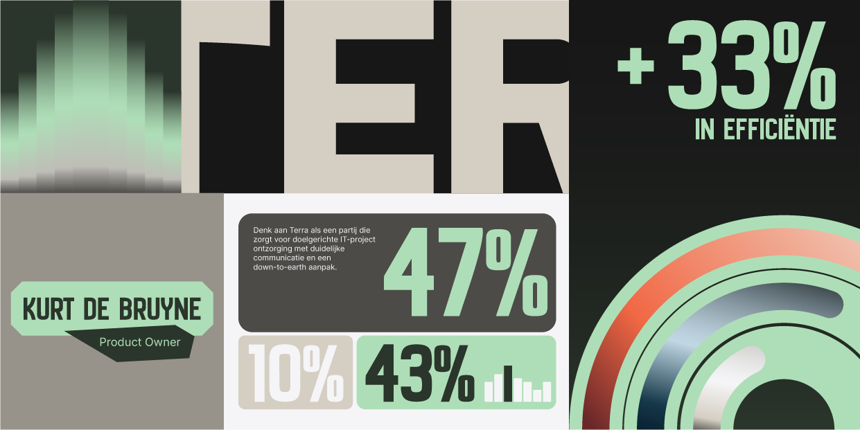
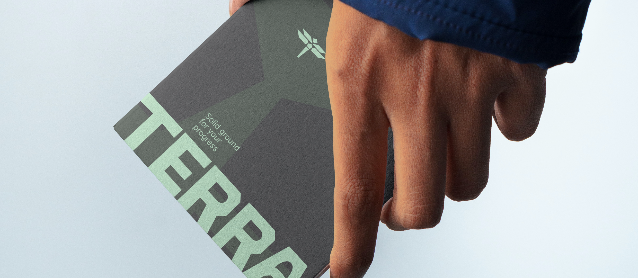
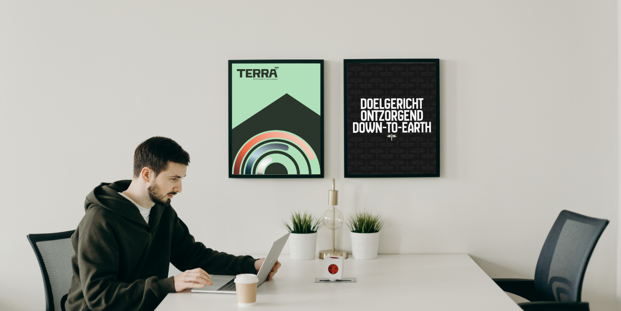
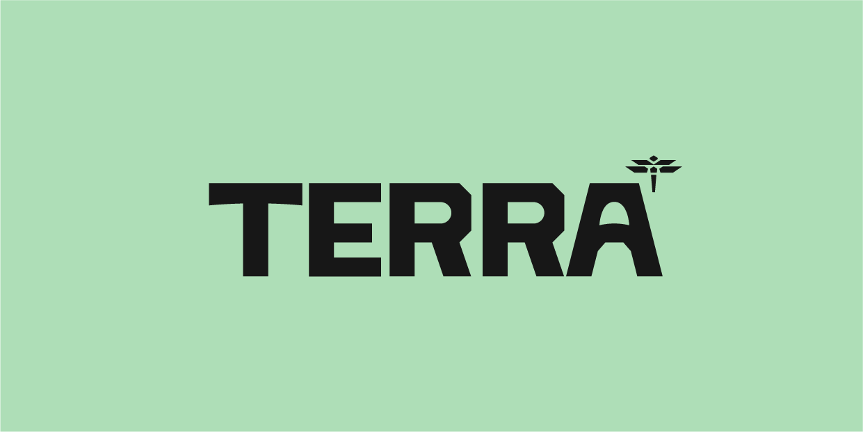
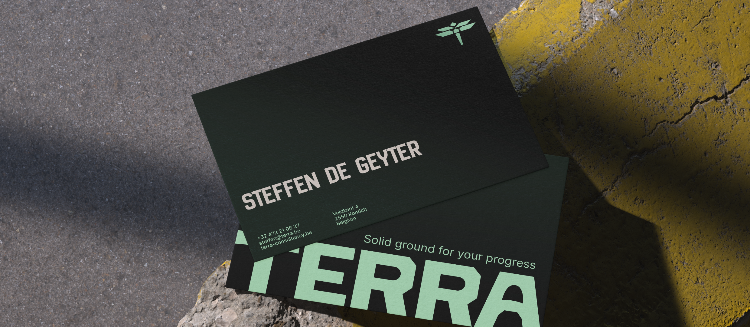
To go back to the roots, we started by listening to their story. From the directions we proposed, they chose Terra to reflect the stable foundation they provide for clients, along with the baseline 'Solid ground for your progress'. The new logo, a dragonfly, captures their ability to keep a helicopter view while pivoting fast. We matched this with earthy tones for trust and a bold, custom-made wordmark for impact. The result is a brand that breaks with the fluff and positions them as the down-to-earth experts they are.