Branding


Accessible brand, premium platform.


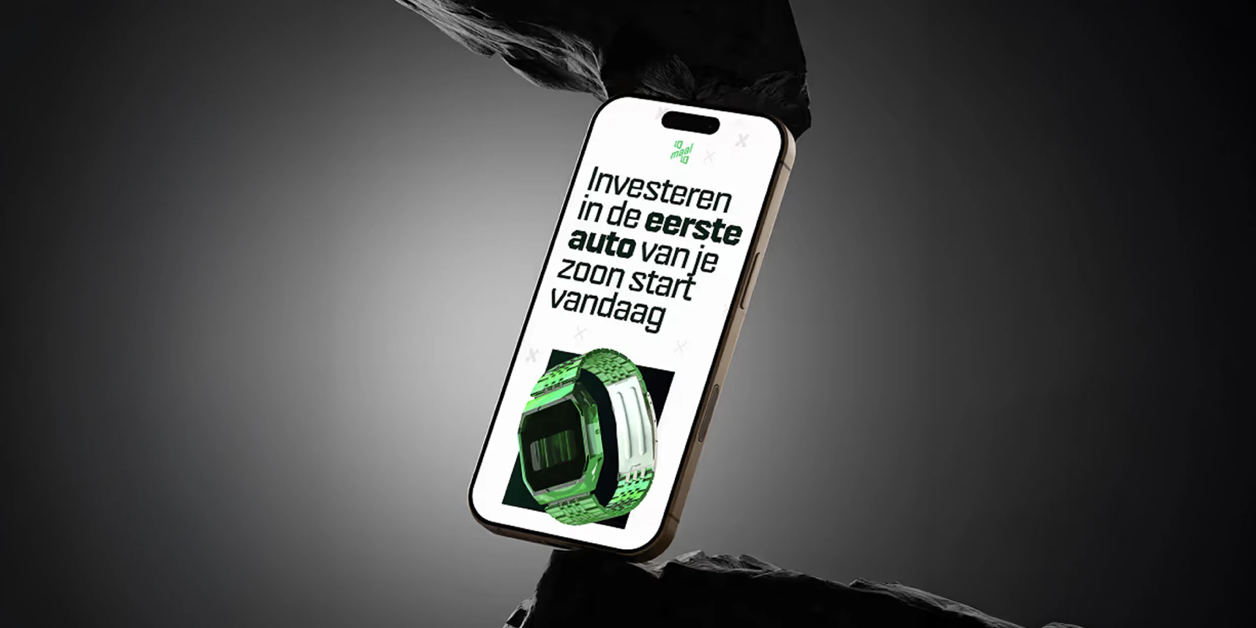
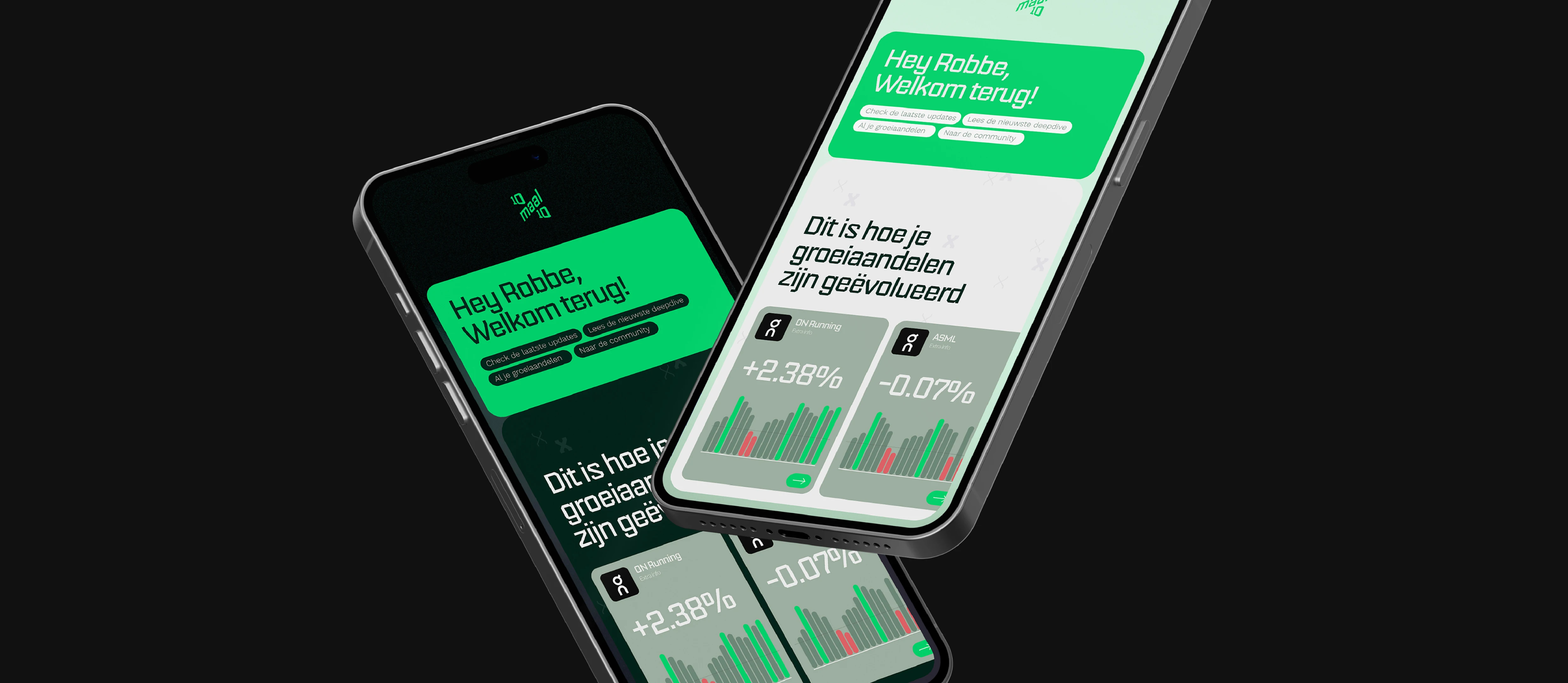
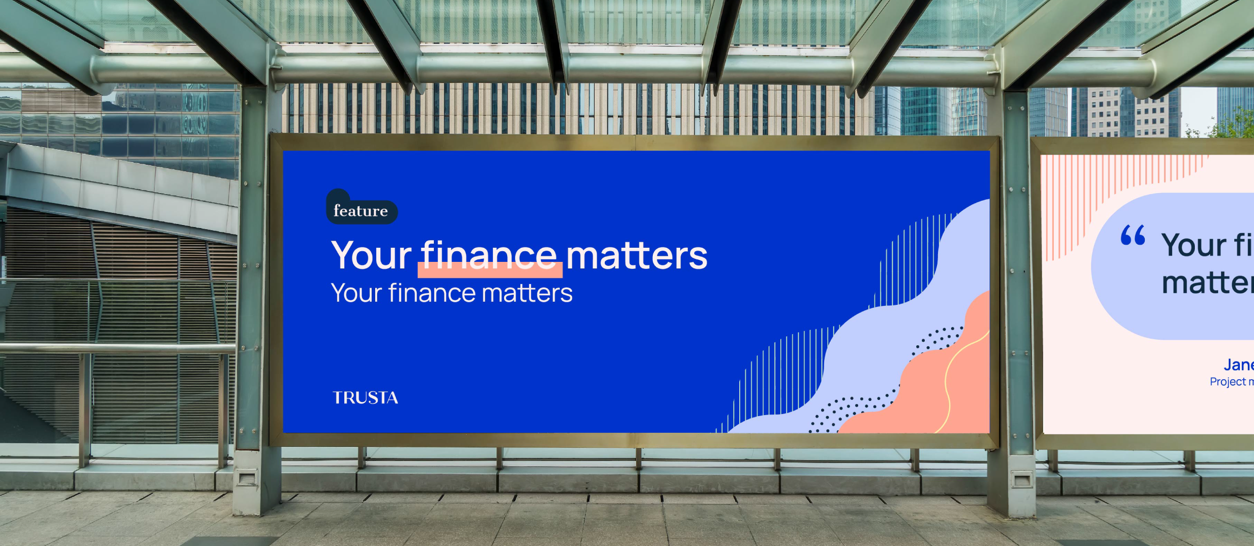
We were approached by Robbe, a young financial advisor with a bold vision. He wanted to build a community-driven platform to help people multiply their wealth by ten in ten years. But the investment world is crowded with stuffy banks and shouty finance gurus. He needed a brand to cut through the noise. Something that felt exclusive enough for serious investors, yet youthful and accessible enough to build a real community.
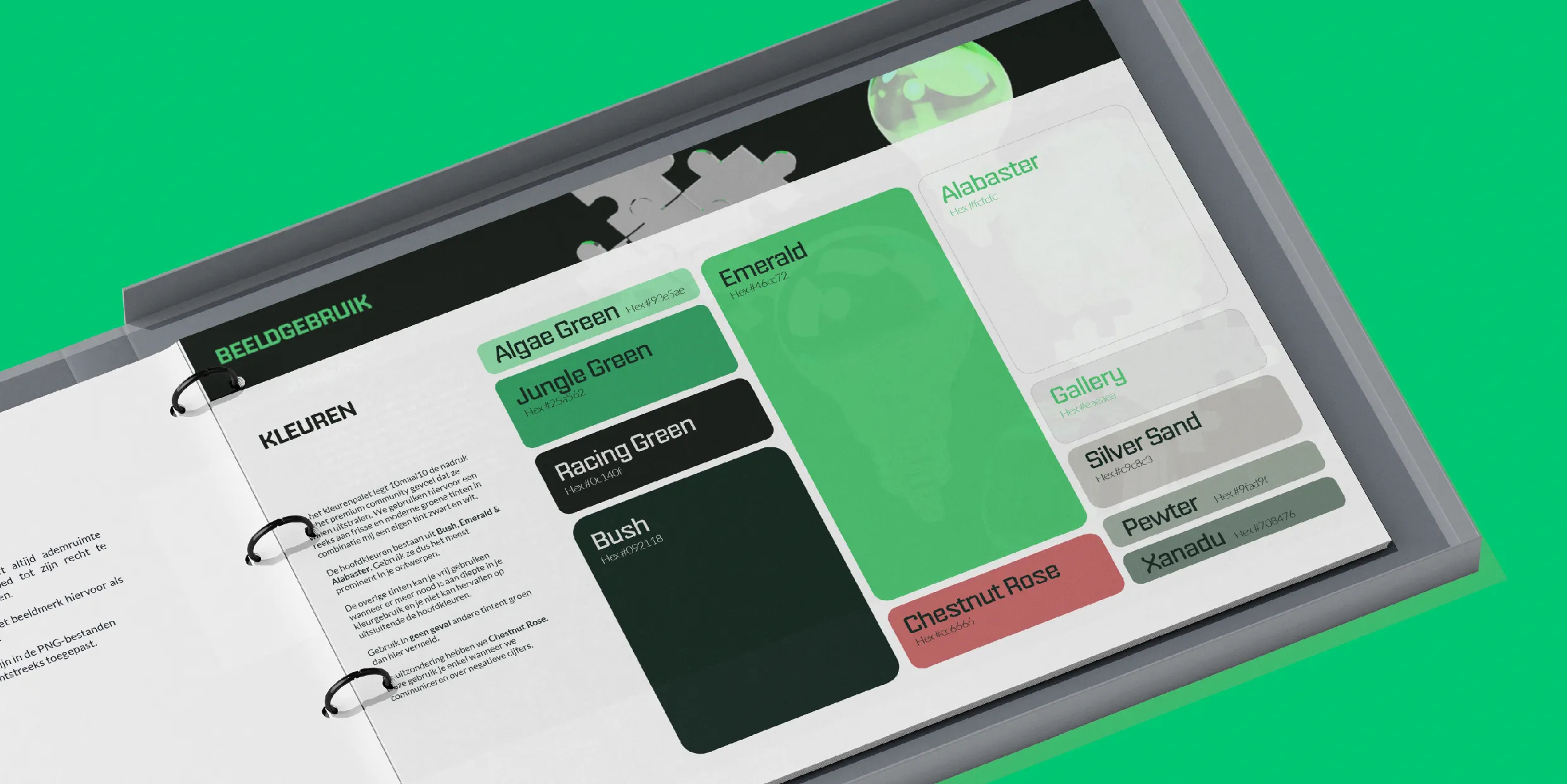
We built a brand that balances exclusivity with energy. Their logo puts the name front and centre, making it easy to recognise and search for in multiple languages. We combined a premium look with a fresh, contemporary feel that matches Robbe’s enthusiasm. And of course, we didn't just hand over a logo. To help him stay on-brand while launching, we worked directly with his developer to nail the implementation. It was a clear success: Robbe hoped to sell out the first 100 of his limited spots in a month, but they sold out in less than 24 hours!