Branding


Getting the most out of an existing brand.


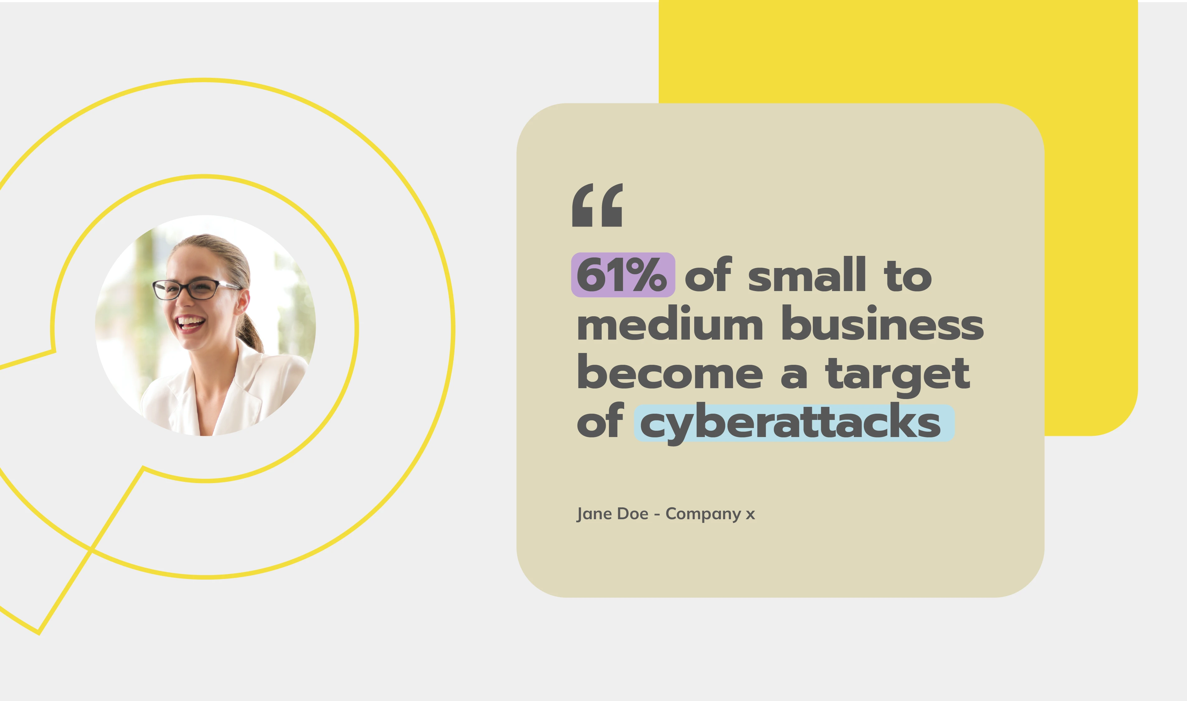
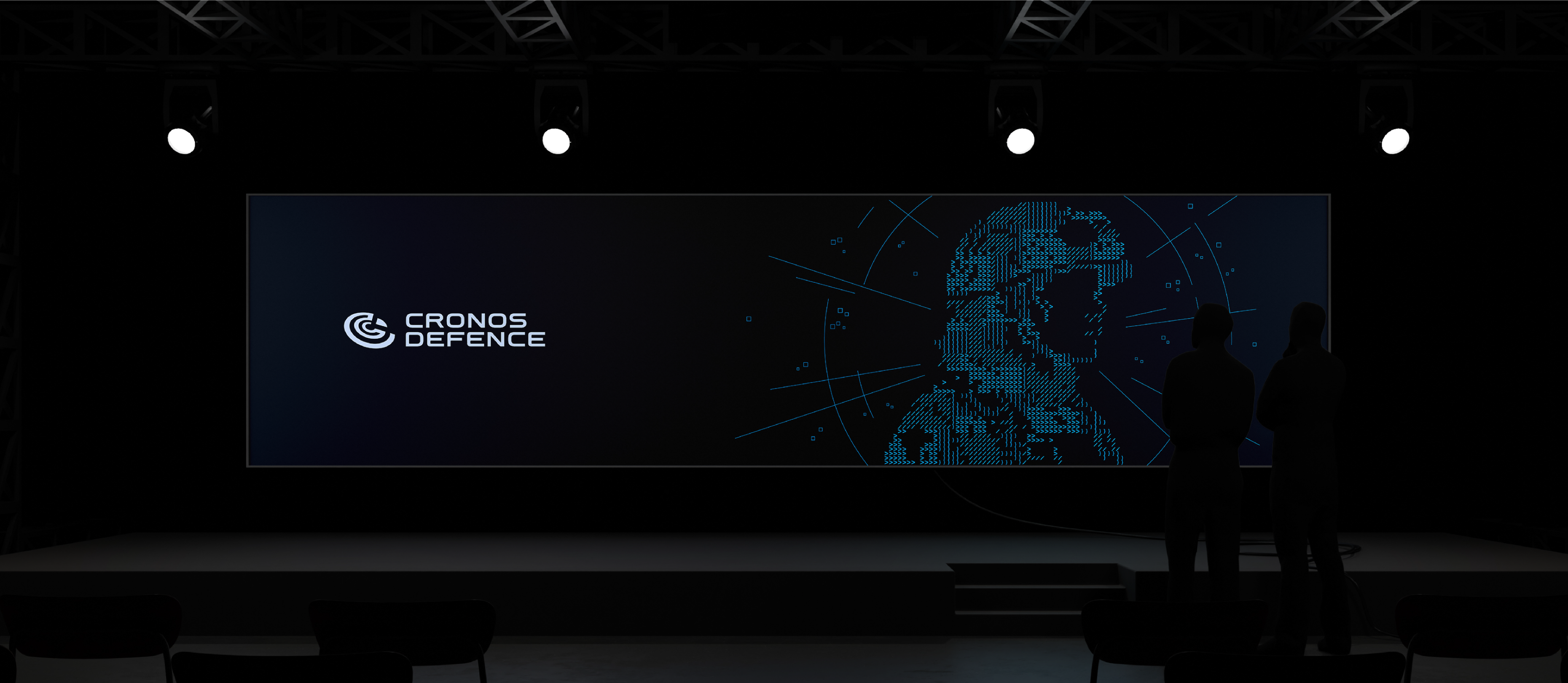
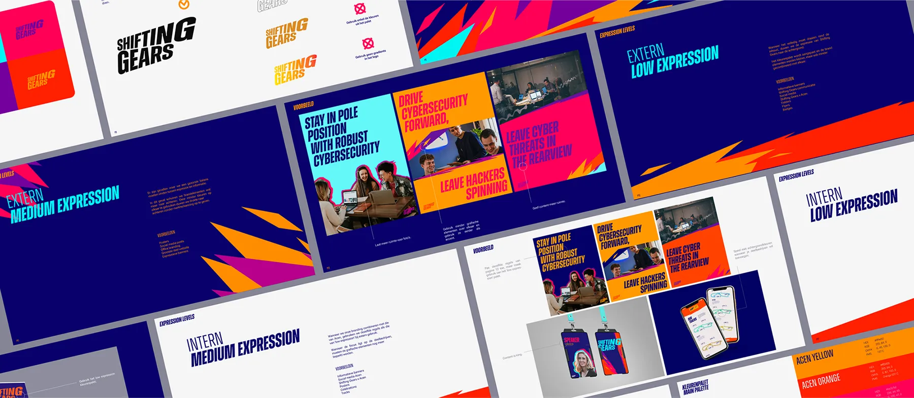
Orlox had the branding basics: a logo and colour palette. What they didn’t have was a distinct identity. And their communication felt stuck and inconsistent because it didn’t make them feel like innovative cybersecurity experts.
So, Orlox wasn’t looking for a total makeover. They just needed a way to make their existing elements work harder, creating a brand as sharp as their security solutions.
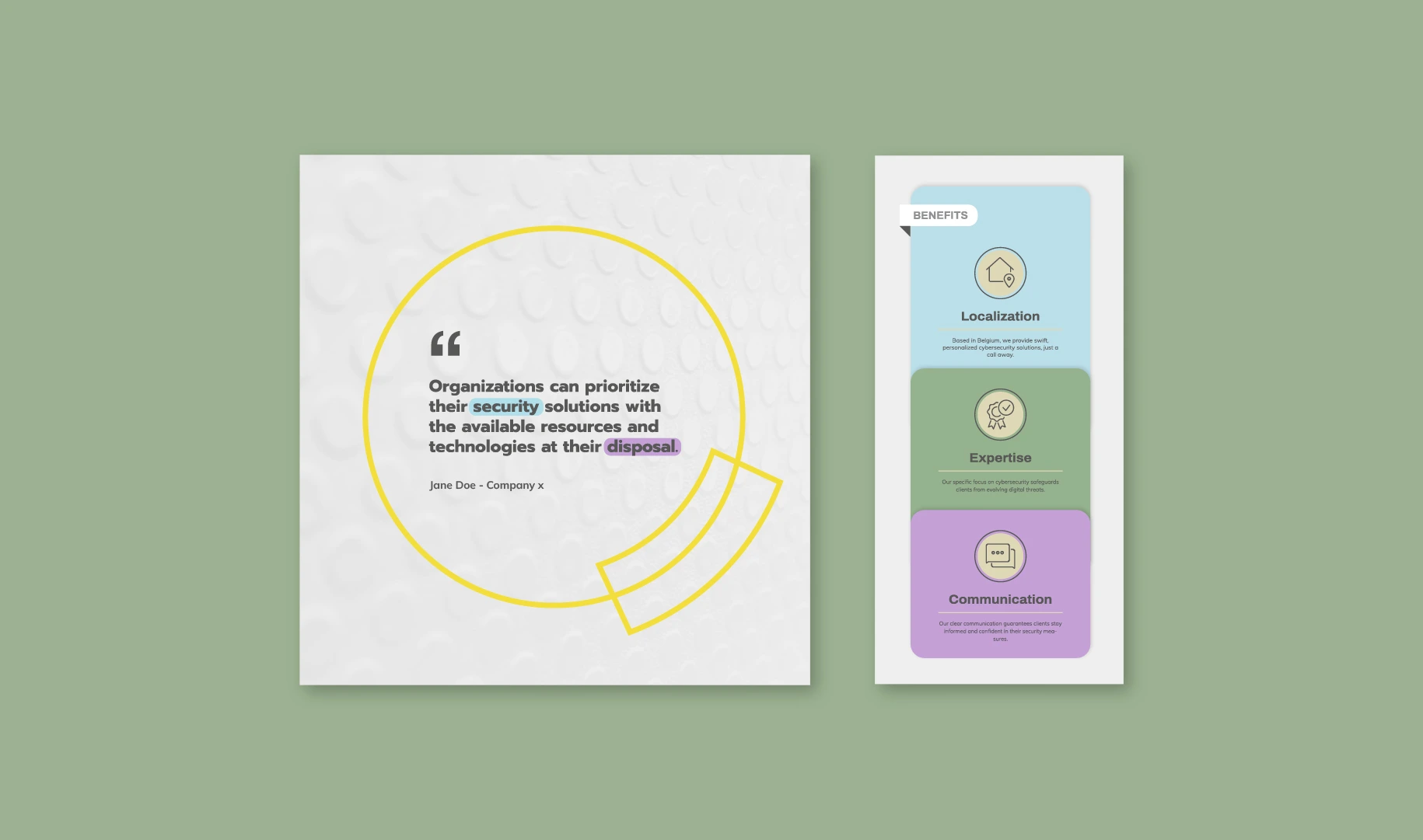
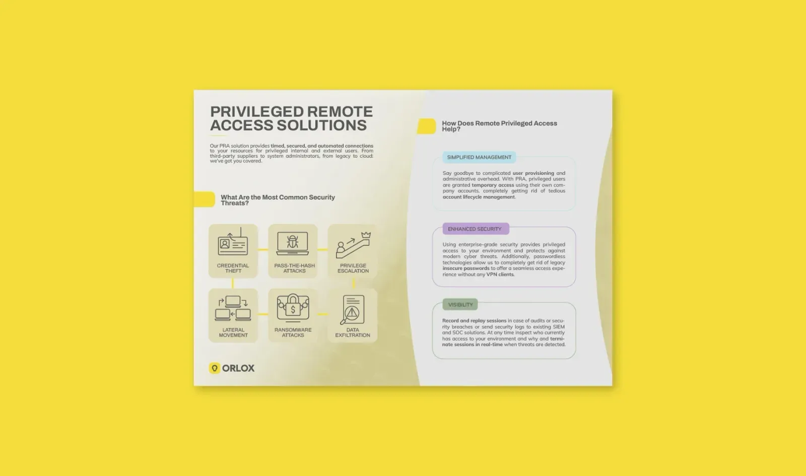
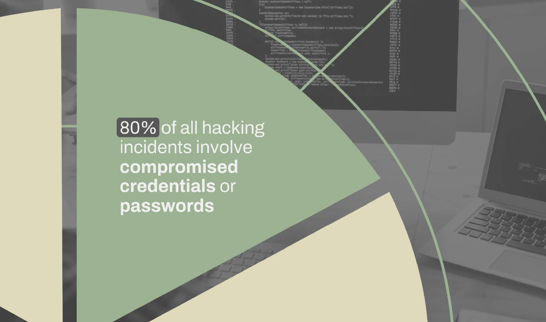
We didn’t start from scratch, but dug deeper into what was already there. By expanding their secondary colours and reimagining the logo’s DNA, we built a flexible design system that feels fresh yet familiar.
They liked it so much that they asked for a pitch deck rework, a full suite of templates, and a website! In short, we gave them a dynamic and easy to use brand identity that finally fits.