Branding



A flexible brand refresh to match enterprise ambitions.



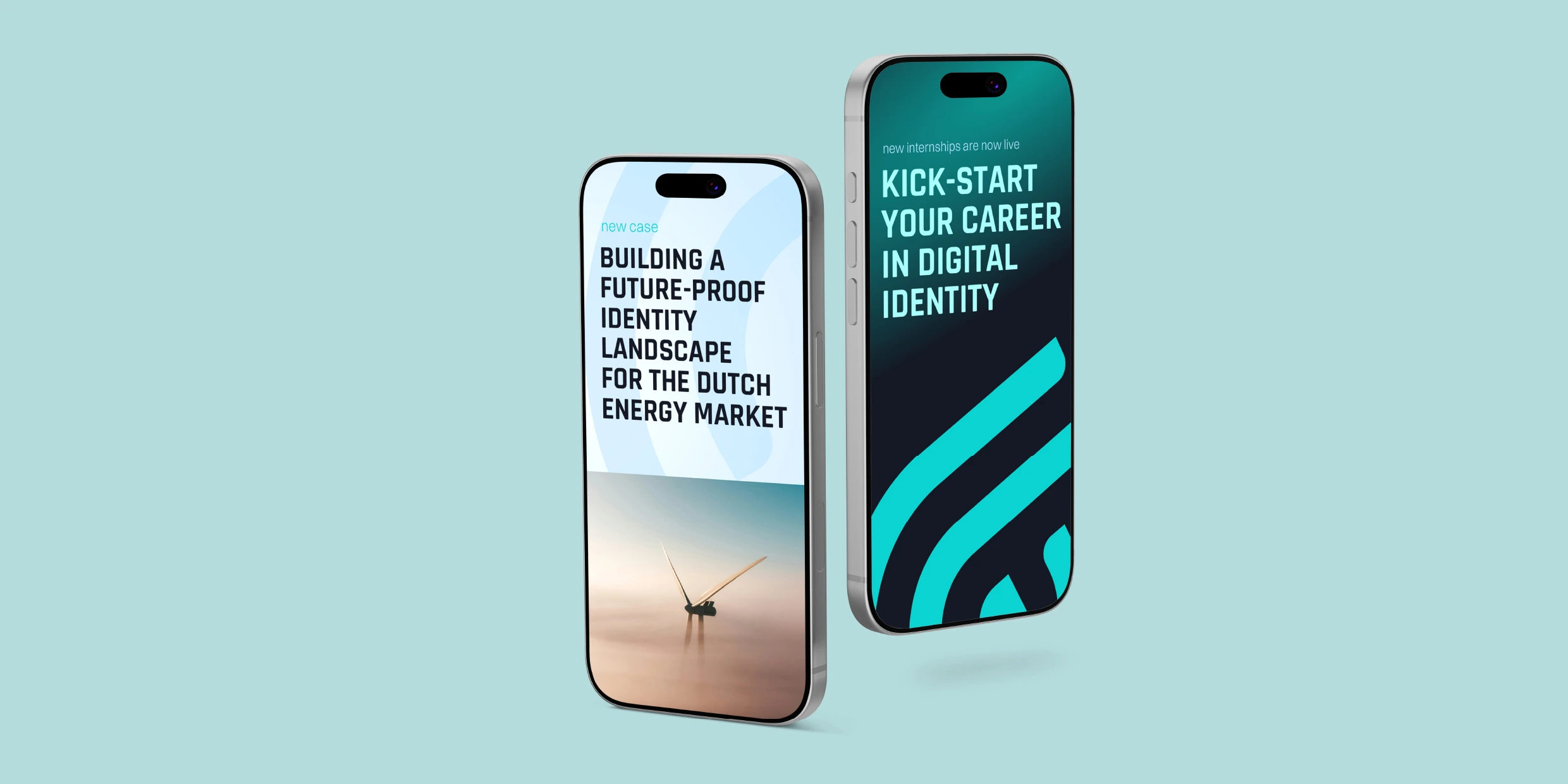
After an organisational shift, IdentIT wanted to take the next steps in their growth as a standalone company. While their business was growing and maturing, their visual identity hadn't quite kept up. As time went on, they started running into certain limitations. For example, their primary colour, a bright turquoise, only really worked on dark backgrounds. As a result, there wasn’t enough variety in their social posts and graphics.
IdentIT didn’t want a complete overhaul, but a smart brand refresh. They were looking for a flexible system that respected their legacy while reflecting their new ambitions.
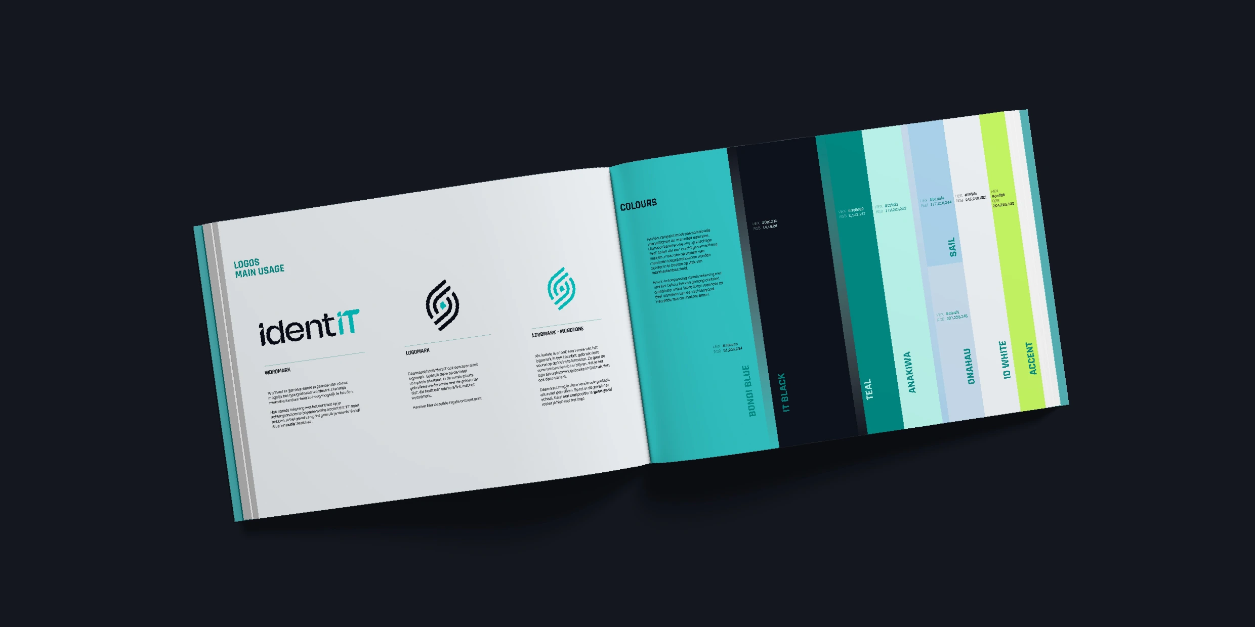
Instead of starting from scratch, we refined what already worked for IdentIT. For example, we smoothed out the logo's curves and expanded their colour palette to introduce a sharp accent colour that works on both light and dark backgrounds.
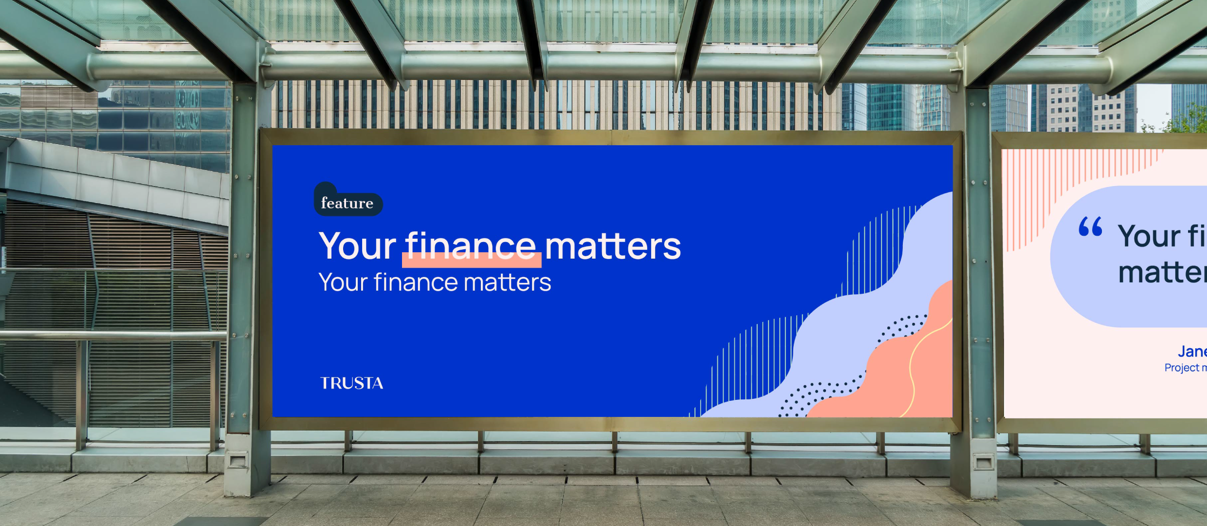
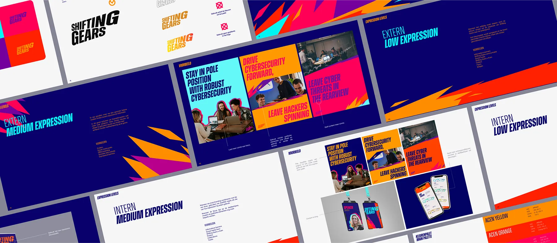
Then, we built a flexible library of graphic assets and paired it with an easy-to-understand brand guide. This shows them how to use their updated typography, colours, and layouts. Their team can now easily build on-brand visuals in just a few minutes, giving them a polished look without needing design skills.