Branding


A rebranding where mitosis meets marketing.
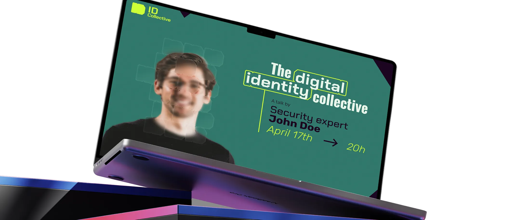


ID Collective had a clear vision for their new community of digital identity experts. They wanted to stand out from the pack but stay accessible at the same time. Turning that vision into a reality proved to be a bit trickier than they expected. They needed a brand that worked just as well online as it did at in-person events, without being a headache to manage. So, they asked us to refine their concept into something bold, flexible, and easy to use.
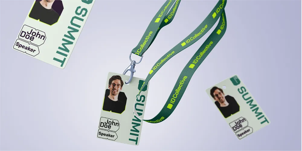
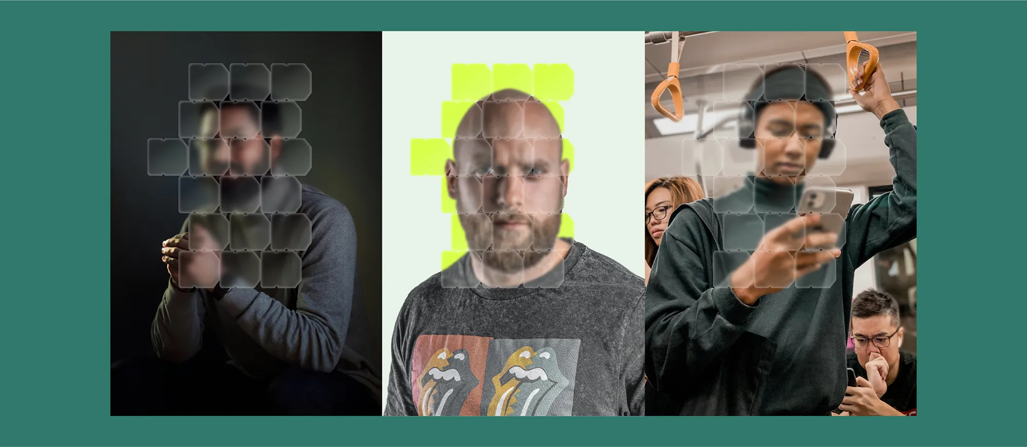
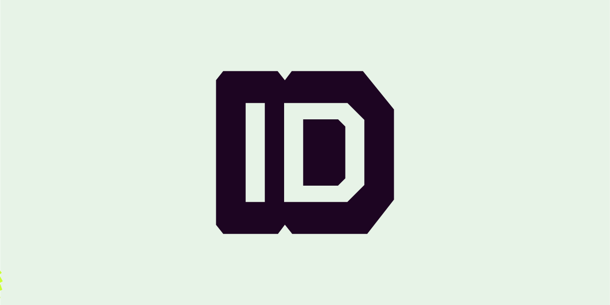
ID Collective’s inspiration gave us a great starting point: mitosis, the process of cells dividing and expanding. Using that as a base, we created a dynamic logo that represents connection and growth. But we didn’t stop there! We knew ease of use was key, so we built a flexible design system where the logo morphs into reusable shapes. The result is a toolkit of ready-to-use assets that lets ID Collective create high-end visuals with zero stress.