Website


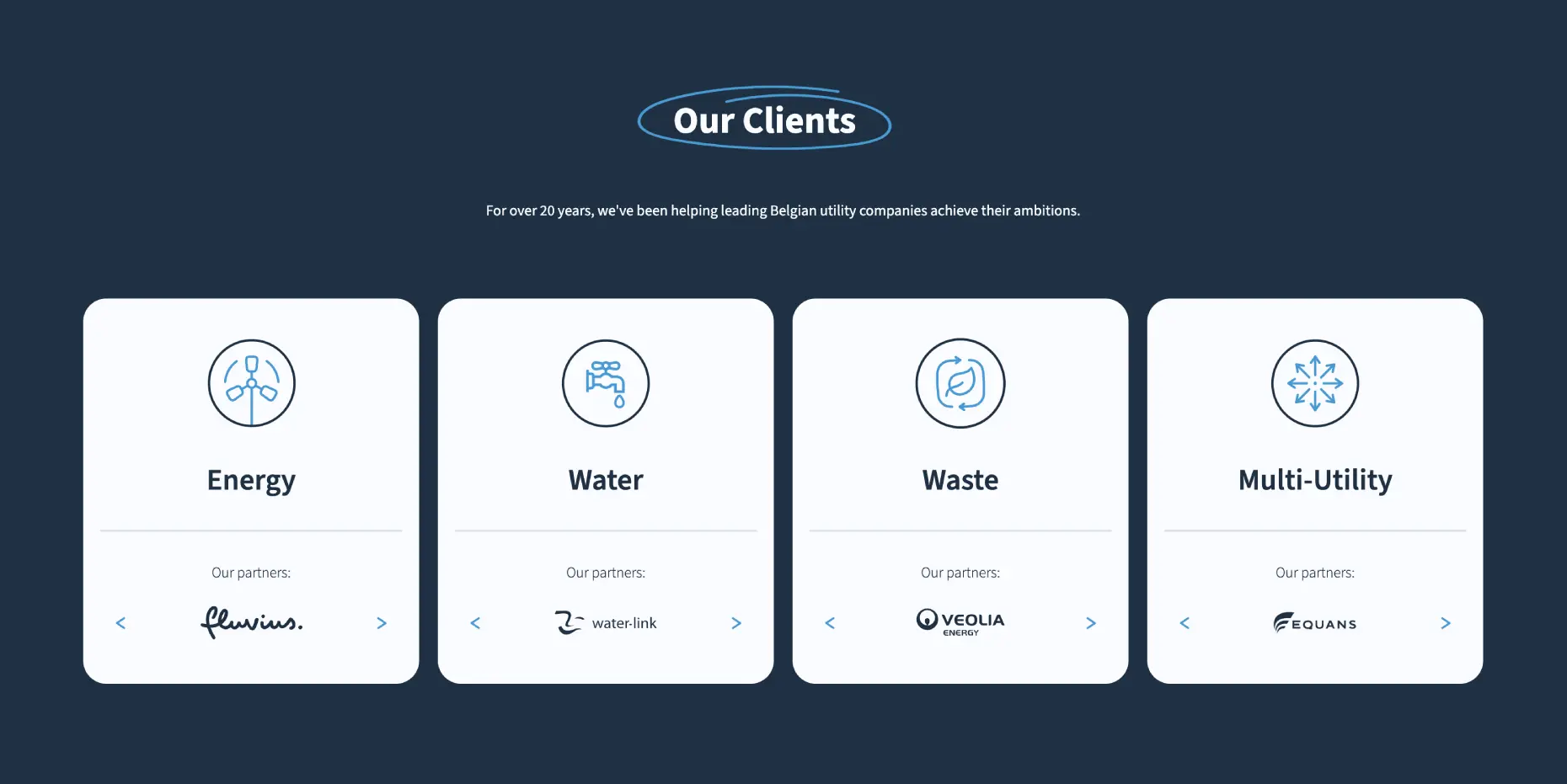
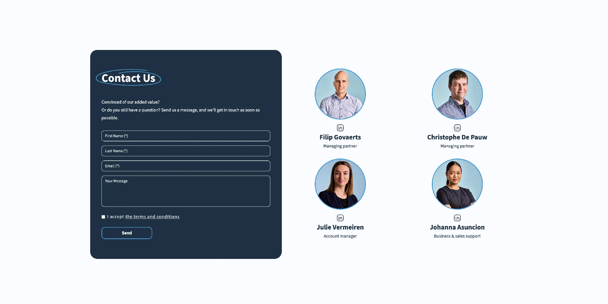
Putting a face on utilities.
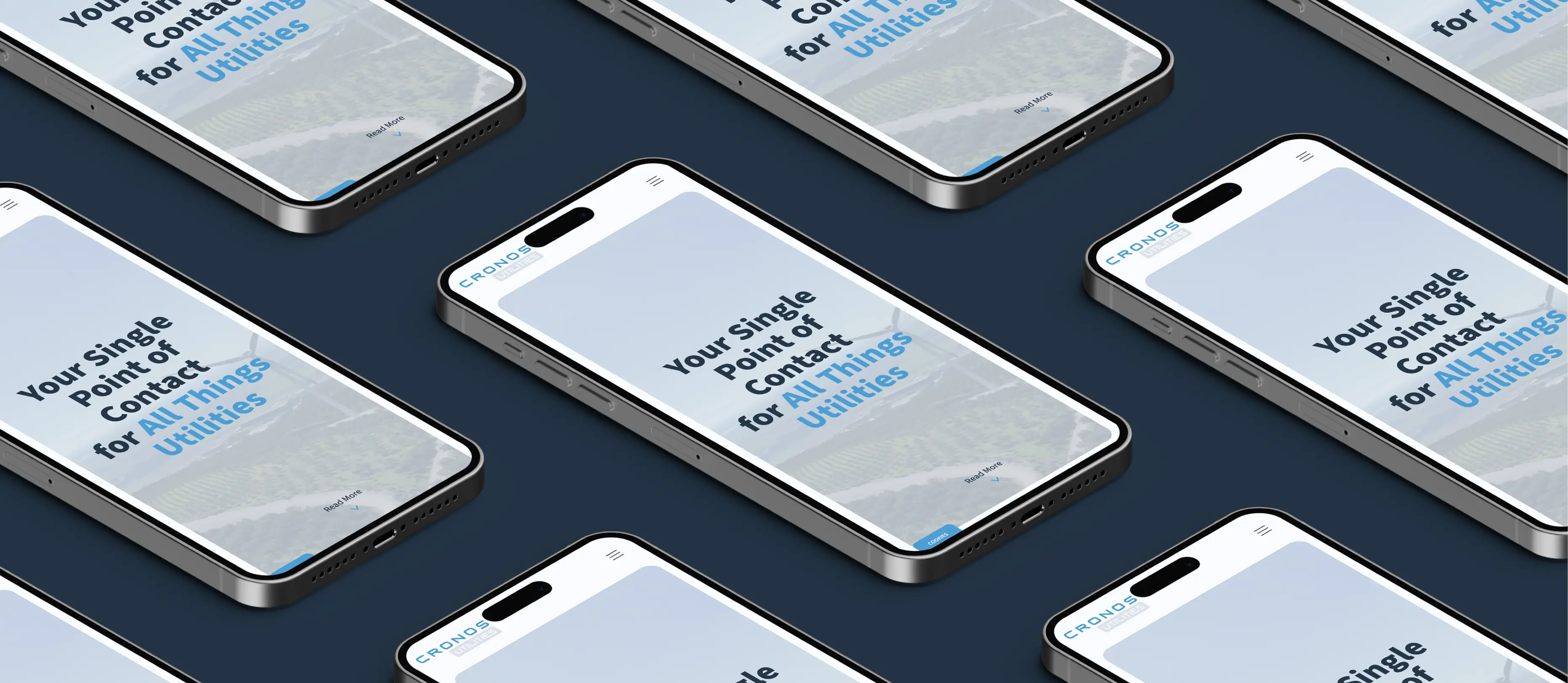


Cronos Utilities is a smooth-running sales engine, but their website was lagging behind. It was built years ago and simply didn't match the reality of their business anymore. It felt outdated and missed some digital essentials, dragging down the overall impression. They needed a modern upgrade that showed their true face, all without inventing a new brand identity from scratch.
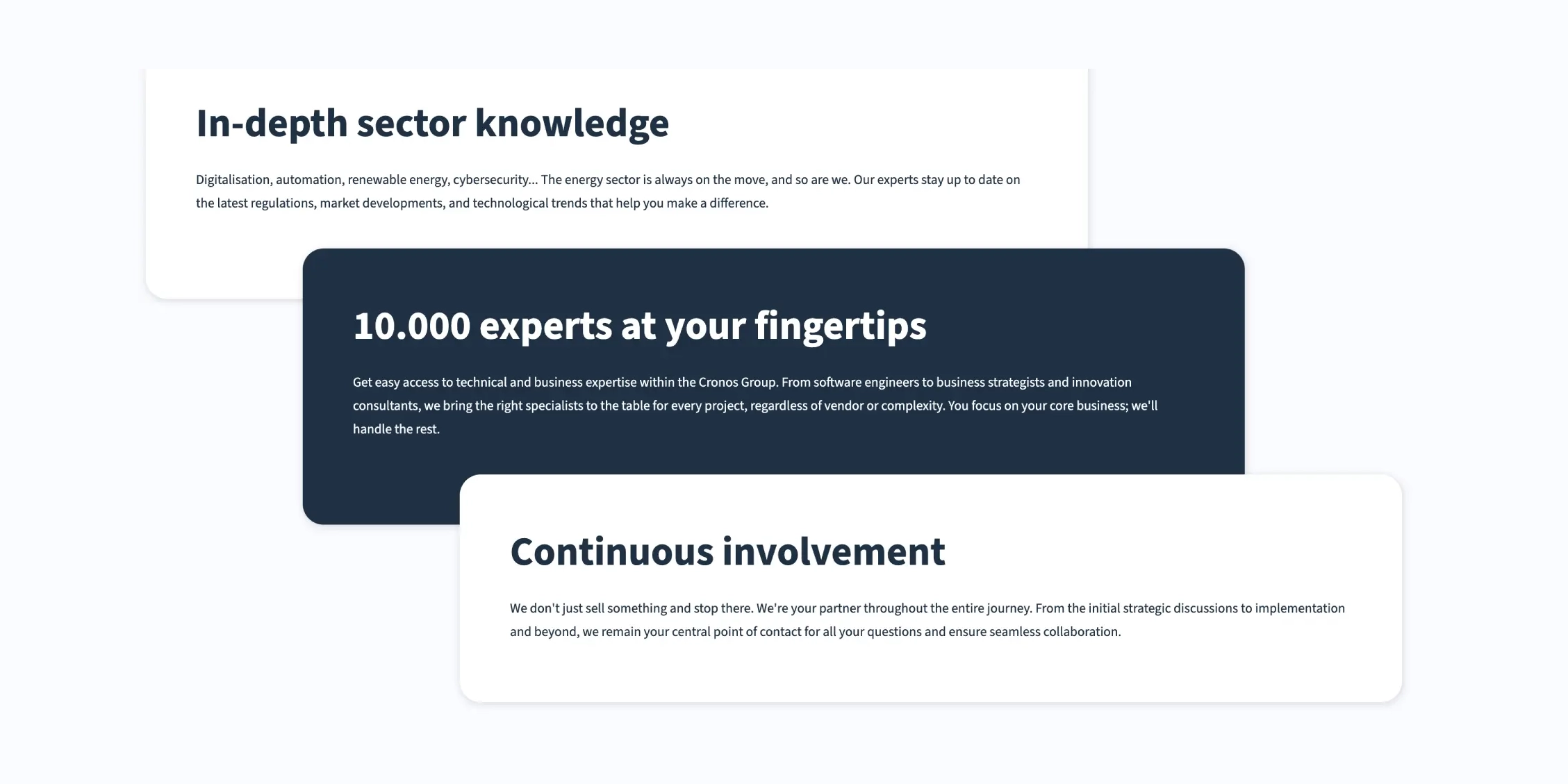
We proved that size doesn't matter. We built a one-pager that gives them a modern touch and connects clearly to the utilities sector, all without needing a full brand update. By bringing the faces of their salespeople to the forefront, we made the branding feel personal. We also fixed the technical basics, from metadata to favicons. Cronos Utilities now has a compact, modern site that finally reflects the quality of their work.