Branding


Engineering a brand with purpose.


Coretecs was entering a competitive Industry 4.0 space with a strong service concept but no identity to back it up yet. The founders had clarity on vision and values. However, they lacked a name and visual system that could communicate both technical precision and strategic thinking. Without a distinctive brand, they risked blending into generic messaging, making it that much harder to lead conversations with OT and IT leaders who value clarity, credibility and differentiation.
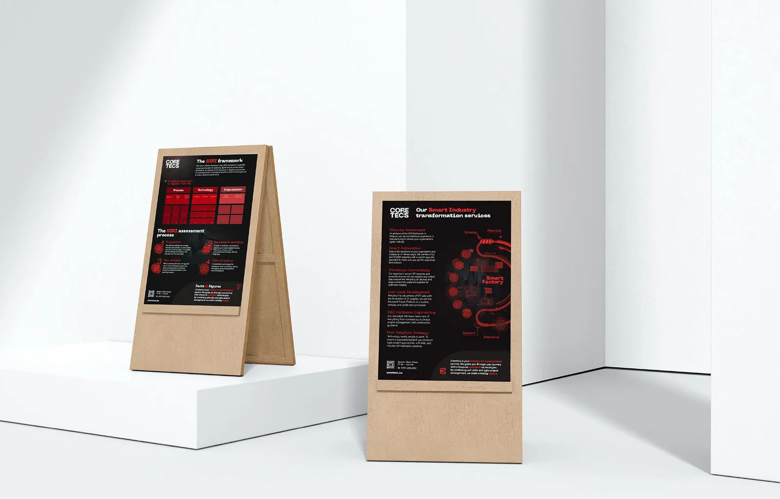
We began with a focused strategy workshop to surface Coretecs’ core differentiators. From there, we created a name rooted in the idea of connection, analogously marrying cognitive logic with engineering rigour. We also built a visual identity around four defining values: energy, ambition, boldness and expertise. The outcome is a punchy logo, colour palette and typography that confidently addresses industry professionals.
%20(1).webp)

%20(1).webp)
%20(1).webp)