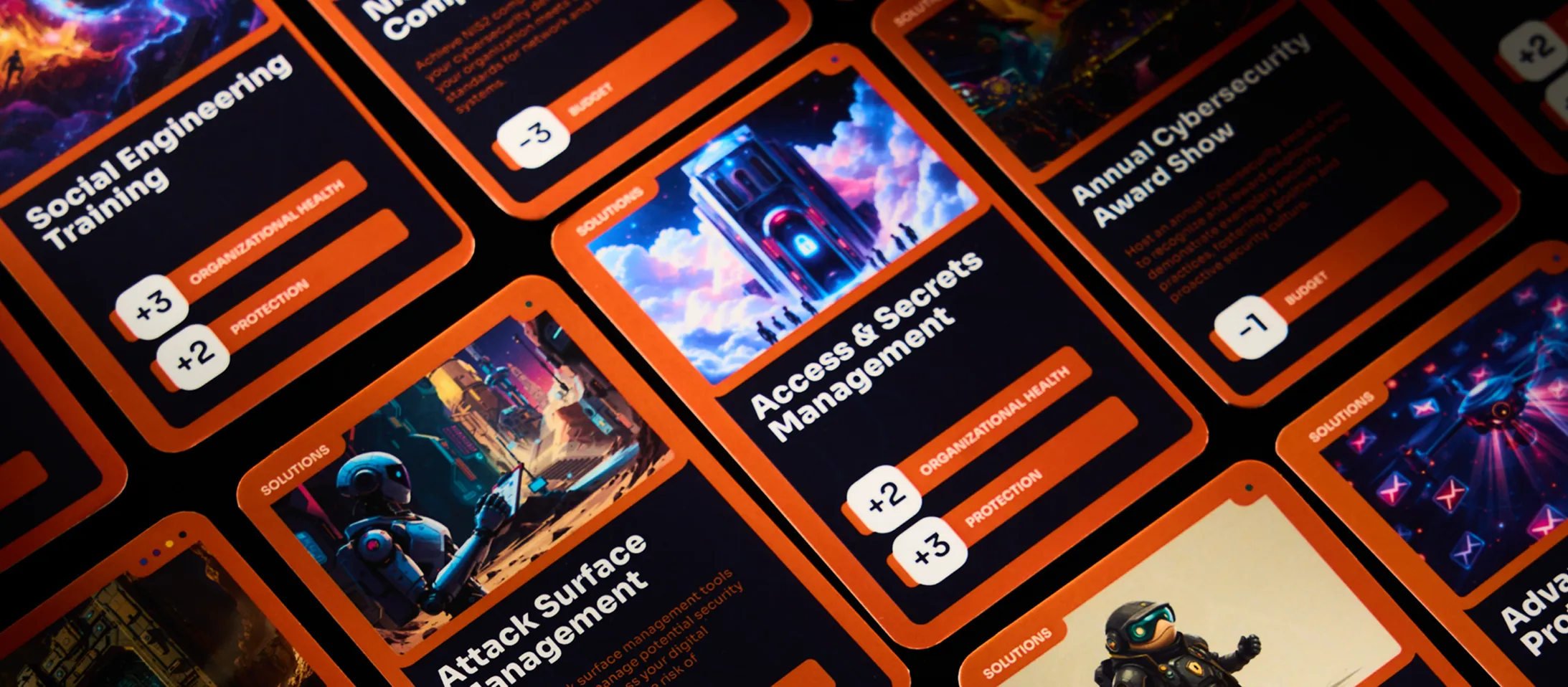
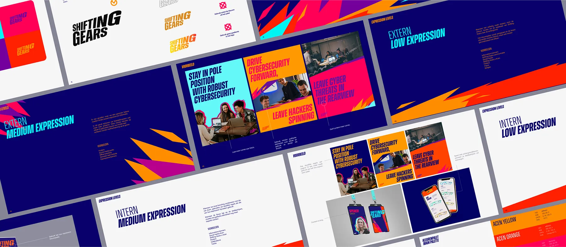
Cybersecurity isn't a game... or is it?
Accessible brand, premium platform.
Mastering the art of the content waterfall.
A confident start for a new brand.
Building authority on a deadline.
SEO-first marketing, right from the start.
Launching a new brand from pole position.
Adding focus and flow to a growing brand.
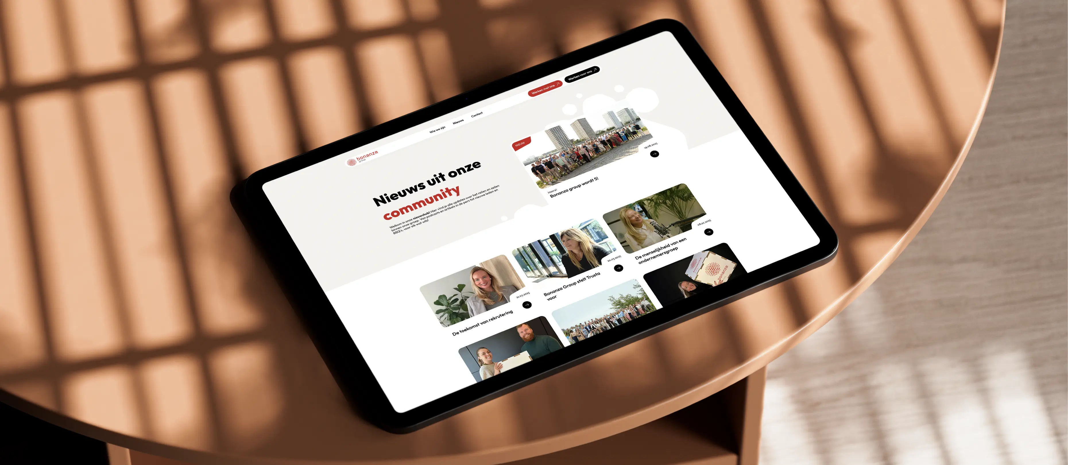
A professional home for a people business.
These booths were made for boldness.